
This is similar to the one above, but the number is in a different font.
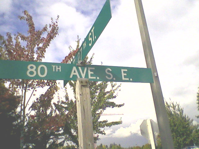
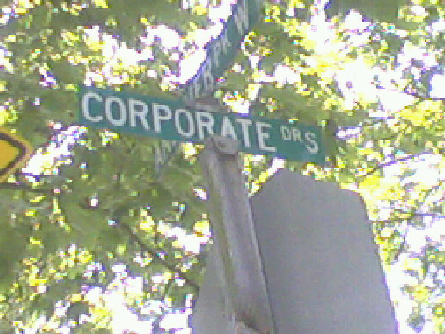
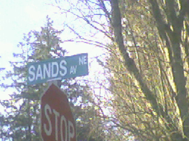
Street signs are very much a part of a city's identity, as everyone sees them and uses them for navigation. Street signs appear pretty much anyplace where two streets intersect, and thus basically litter a city.
All images taken by me, Morgan Wick, unless otherwise indicated. If I am violating any copyrights or laws, I do so unknowingly; I will take down or reduce any offending images at the request of the appropriate authorities. Although I believe the use of these images on this site for educational purposes falls under the "fair use" clause of United States copyright law, if any appropriate authorities believe that these images could be used for a non-fair use violation of those laws I will gladly reduce the images to be more useless to copyright theives.
If you have an image of a street sign I don't have an example of, feel free to e-mail me at mwmailsea at yahoo dot com. I will give you, or the original source, credit for your image.

This is similar to the one above, but the number is in a different font.

These street signs went up sometime in the early-to-mid part of the first decade of the new millenium. They use a bigger font to make the street names clearer. Seattle generally only uses ordinals on the signs for numbers through 9; although it's shadowed here, you can see "6th Ave" is used on the bottom sign, but "65 St" on the top. Seattle generally uses the longer abbreviations for things like avenues.

This oddity provides a better view of the ordinal.

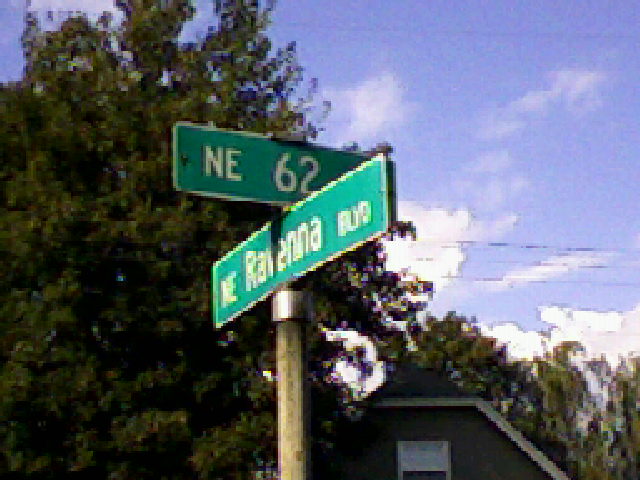
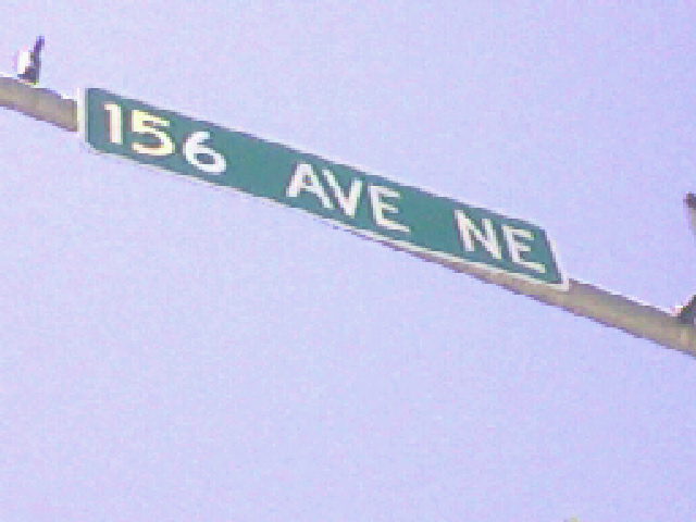
This sort of sign is of older vintage.


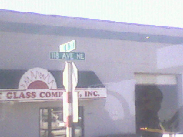
A slightly different style of sign is seen in parts of downtown Seattle. Note that in this sign, the ordinal is the same height as the street type.
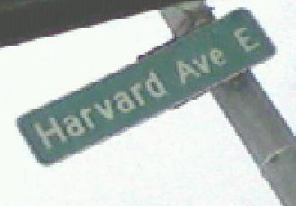
A similar sign to the one above.


These two signs, with the rims around the sign and the tab, are only seen in downtown Seattle.
On most Seattle signs, this arrow indicates that a name applies to a street only in the given direction.

This unusual sign is probably of very old vintage. Before recent reconstruction work, a similar one appeared a couple blocks south at 9th Ave and Pine St.


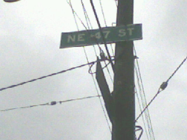

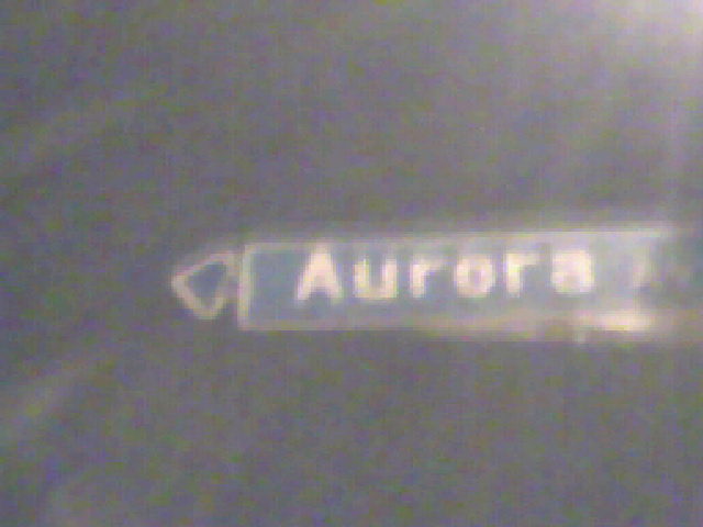
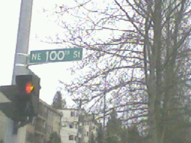
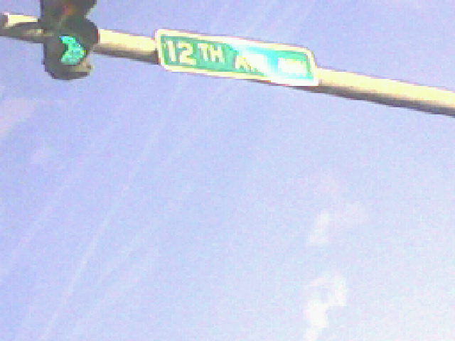
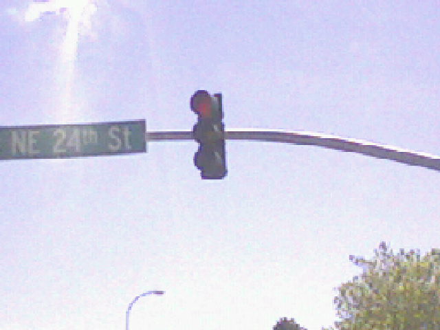
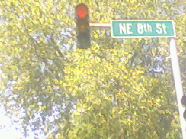
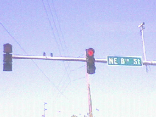
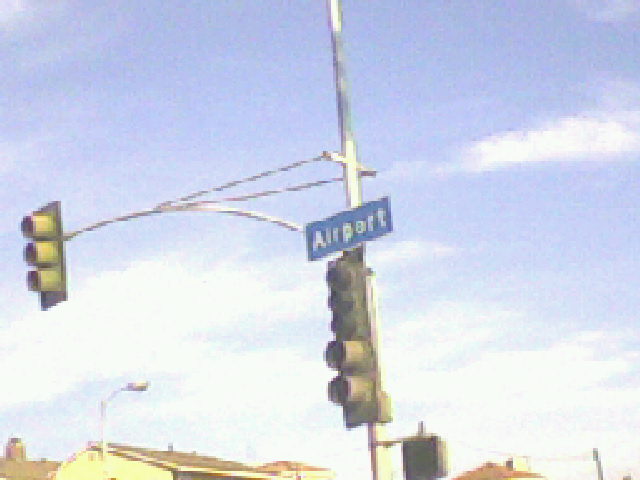
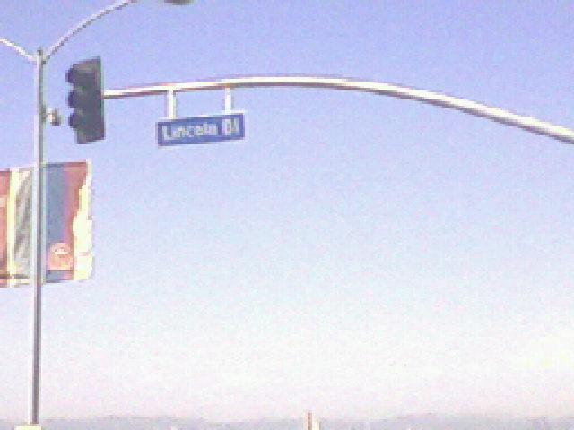
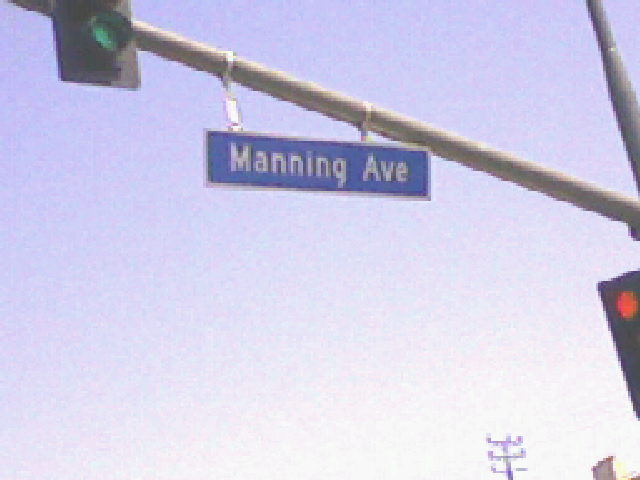
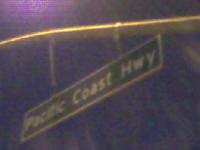
Overhead signs, used at stoplights, don't generally follow any real fixed pattern over all the city, though they do follow a pattern along a street. There's a vague pattern to them, but...
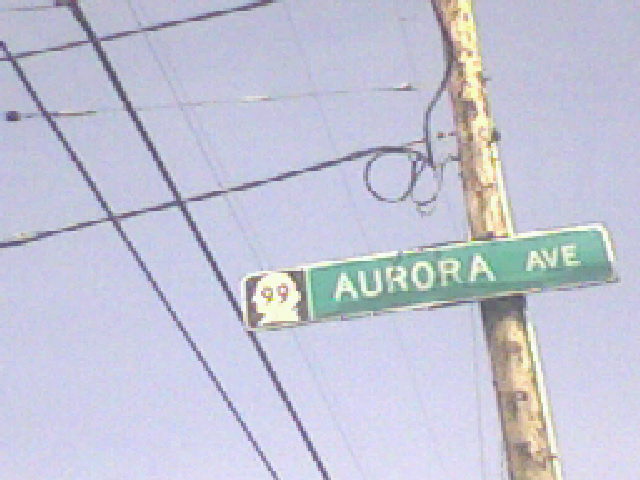
These are the overhead signs on Aurora Avenue (Highway 99) in north Seattle, showing the state highway designation.
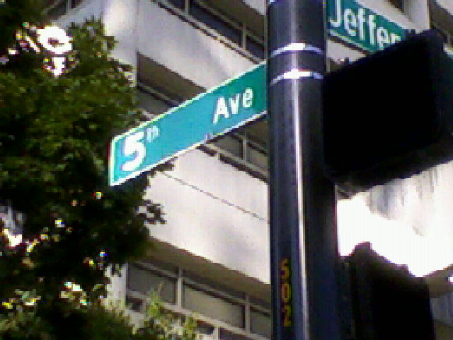

These abominations have started to pop up in recent years and mark a radical change to Seattle signs. Well, relatively radical. The type of street is now mixed case and (though this isn't captured in any of my images) the same height as the direction. And if you don't think this is a negative development, just look at the Jefferson St sign and the weird relation of the block number to the "St" indicator.

Arrows are now added to the street sign itself, not attached to the end, and are a lot more common. For example, arrows are now attached to signs where the directional indicator of a street changes, as well as where (as here) streets just end, where before they were not. And if you're still not convinced these are abominations, look at this... I don't even know what this is.
For especially long street names, a tab is sometimes added on the sign itself with the block number under this new system.

Ordinals are now added to all numbered streets, not just 1-9, and are now lowercase. Thankfully, Seattle is only phasing in this sort of street sign, so several different styles still predominate.
Most overheads now follow this style, a departure from what similarities existed amongst the older overheads.

Overhead near Downtown Seattle. Lowercase street type - in fact, lowercase anything other than street name - is normally incredibly rare.
Let's compare Seattle to a couple of Seattle suburbs.
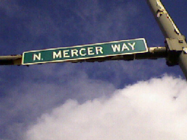


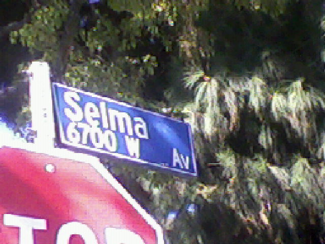
Several completely different styles of street sign can be seen in close proximity in Mercer Island. The tab at the bottom of the brown sign may be intended for block numbers, but I haven't seen this. The sign in the last image uses no ordinals.


As promised, Tukwila's overheads.

These overhead signs are increasingly common, with the city seal and more of a distinction from the same narrow sign you see everywhere in King County.

This sign is also within the Redmond city limits, just barely.
These overhead signs are increasingly common in Bellevue. Older signs are similar, but plainer, not as narrow, and with more space on the top and bottom, and less on the sides.
A slightly different Bellevue overhead sign.


A couple more examples of Bainbridge Island signs. Sorry for the blurriness, but you can see an arrow in the first.
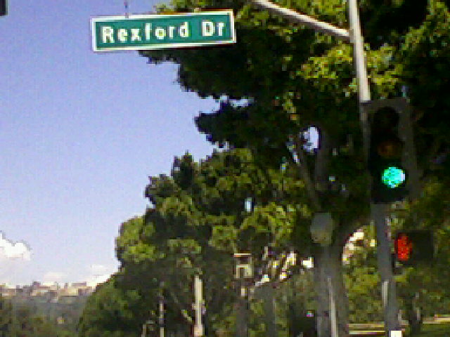
Now let's look at a very different part of the country.

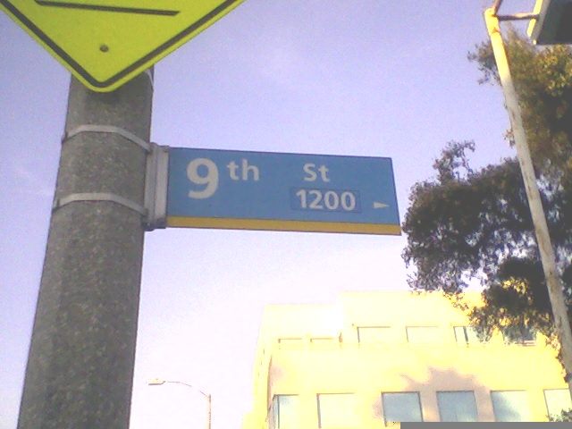
Old style signs are a very dark shade of blue, so dark that it can look brown at some angles. The width of the letters varies with how long the street name is. Old style uses the longer abbreviations, and all LA street signs indicate what the block number is on the street referred to. Old style signs have an arrow on the accompanying tab indicating the intended direction. Middle and new vintage signs do not have such an arrow, but as those signs are not "stacked" as in Seattle, it is not too much of a problem.

Middle vintage signs look very similar to new style signs but with a separate tab for the block number. They are also a lighter shade of blue. Middle and new vintage signs, however, both use the tighter, two-letter abbreviations for street type, and unlike old vintage, street names are mixed case. In unincorporated areas of Los Angeles County, the signs are generally LA's middle style.

Another example of middle vintage at America's most famous intersection.
New style signs are the most predominant type but they can't be summarized by one sign. The block number and street name are always the same size, and all new style signs have the same trapezoidal shape, but several arrangements predominate.


Here, the street name (with an ordinal in the first image) is vertically centered. The street type is the same size as the block number, and both are aligned right. This is typically used for shorter street names.
Street name above the left-aligned block number. Street type is same height as block number and is bottom-right aligned, so it serves as a continuation of the block number line. This is actually more common with especially long street names, to give the top line the most space.

Street name and type on one line, same height, over the left-aligned block number. A variant with a small, top-right aligned street type is also sometimes seen. One strange difference between new and middle styles is that new style drops the dot at the top of an "i". As seen in the Hollywood-and-Vine sign above, middle style does not engage in such weirdness.
These two types of overhead signs, especially the first, are the most common.
Reconstruction of Santa Monica Boulevard between I-405 and the Beverly Hills city line, to turn "Little Santa Monica" into regular eastbound lanes to double Santa Monica's size, resulted in the installation of these overheads. The longer abbreviations may start making a comeback.


For the most part, in the central business district, Beverly Hills does not use overheads at stoplights but instead uses the advance sign seen in the first picture. The overhead in the second picture is more common further from the city center; this was taken along Sunset Blvd. The use of mixed case suggests that these overheads are newer and may make an appearance in the city center if Beverly Hills ever decides to replace any stoplights.
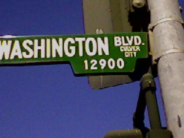
Culver City's overheads are probably newer.

Calabasas' street signs show their rather modern vintage and the relative newness of the city itself. Its overheads are basically inherited unincorporated LA County signs.