I’m pretty sure this is the post I intended to post on Thursday but forgot.

One of the things Robert A. Howard accosted me for in his comment-rant a little over a week ago was my tendency to squee like a fangirl at any links whatsoever.

Now, the main reason I post whenever I get linked, aside from being convinced that this is the link that will bring me everlasting fame and I want to commemorate the moment, is to alert potential advertisers of traffic bumps, so they can bump up their bids accordingly. However, I’m not sure it’s particularly useful for that purpose. Most people probably use Project Wonderful’s “campaign” feature to place their bids, which automatically scale to match current traffic, and PW also provides its own tools to alert bidders of important links, albeit from a select list of traffic generators. Find out more here, although I’m not even sure if this system still works. (Not to say that you can’t get on to Da Blog bidding by hand – I did so successfully on what was really a test bid on a couple of webcomics advertising for Sandsday, though I think I only showed up on one. If that makes any sense.)

So in a new Da Blog Poll that’s been running since Sunday and will continue for a couple of weeks, I want to ask: do you find the acknowledgements of traffic bumps useful or annoying? Do you think they’re useful for advertising even if they are a little annoying to anyone else, or are they useless even for advertising because the acknowledgement tends to lag quite a bit behind the bump itself? You can find the poll in the sidebar, and the comment section of this post will allow you to sound off beyond just the two options on the sidebar.

Those big, hairy critters can be a bit stroppy.

(From Irregular Webcomic! Click for full-sized very fabric of the universe yada yada.)
You know your crisis is reaching monumental proportions when it starts roping in themes that aren’t even regular.

When it starts roping in Harry Potter… and the Star Wars theme that’s been virtually unheard of since Darths and Droids started.

At this point, I wouldn’t be surprised if Espionage got involved… or even the Supers theme that hasn’t been heard from in ages. We’ve already seen six themes out of fourteen that aren’t Death, Miscellaneous, or Me. (Cliffhangers, Mythbusters, Shakespeare, and Martians are the others.)

That leaves Tuesday, Wednesday, Thursday, and Friday strips to finish up the seven strips needed to rope in every last theme… but crossovers will almost certainly be included in there, and it would be poetic justice to put the critical moment one year to the day after the death of Me.

(Then again, it evidently never occured to the Comic Irregulars how close Phantom Menace would come to wrapping up in 200 strips, so why should I give DMM credit for minding the one-year gap? Though who am I to speak? For whatever reason, I keep wallowing in Morgan-Mar central instead of just posting on a non-Morgan-Mar, non-OOTS, non-CAD strip on Tuesday like I’m GOING to do.)

Meanwhile in Irregular Webcomic, we’re slowly going through Armageddon theme by theme, I guess.

(From Darths and Droids. Click for full-sized planning.)

Just when I say I’m going to move away from a small set of webcomics, Da Blog practically becomes David Morgan-Mar Central. Perhaps because Morgan-Mar has a lot of stuff going on all at once, between this and Irregular Crisis.

My already-slim prediction of ending the current movie at #200 is looking unlikely. But we have started the preparations for the next movie – including a rather… unusual… answer to the question of who Jim will play next.

Huh? First of all, who are we talking about? Padme, or the Queen? They switched places for the bulk of The Phantom Menace, but while on the one hand Jim is excited about being a ruler, implying Amidala, he specifically asks Obi-Wan to give his stuff to Padme…

…and given the blossoming relationship between Padme and Anakin in the second and third movies, that would seem to hold more dramatic potential. (A man and a woman role-play a relationship between a man and a woman… only they play each other’s gender. Awk-ward! And a minefield of potential commentary to boot!)

Although Wikipedia indicates that, contra the impression I had gotten from the Darths and Droids annotations (with some help from Attack of the Clones promo materials), Padme and Amidala are actually the same person and the person dolled up as Amidala for most of Phantom Menace is completely unimportant. (Which when you think about it, would make sense for Leia being a “princess” in the original trilogy.)

In any case, we can begin formulating what might happen for the duration of two movies now on the basis of a single strip. Too bad we can’t seem to formulate what might happen for the duration of a week on Da Blog on the basis of a single post. But we will break out of the rut on Tuesday, I guarantee it!

I hate it when that happens.

(From Irregular Webcomic! Click for full-sized parallel tearing.)

So, did you hear? Apparently the very fabric of the universe got torn apart today.

Unfortunately it didn’t involve more themes than just two.

Still, it’s kind of funny that the previous comic involved Death of Being Stared At By a Giant Frog going back in time to deliver Me to administer his own death. Good way to build to the moment.

Or maybe it’ll just cause reality to shift to a new paradigm.

Perhaps in this new paradigm, I actually climb out of my three-comic rut.

These sorts of posts are only useful if you meet me in person. I sometimes get mad at stuff online, but that either manifests itself in the physical world (where you can’t be affected) or completely differently online.

If I’m getting too mad for me to control myself, the best thing you can do is let it happen.

Whatever you do, don’t attempt to apply some sort of reprimand while it’s in progress, certainly not one stemming from letting my madness make you mad as well.

Don’t try to psychoanalyze it, don’t tell me I’m doing anything wrong, don’t tell me I’m getting mad at something minor. Any of those things will just make the problem worse, or even reignite it if it’s seeming to subside.

Human emotion, by definition, is not rational. So why do we need to make it seem rational? Why do I need to be mad at anything in particular?

Why do I need to become something inhuman? When I get mad, I end up mad at myself for being mad, and then I end up mad at myself for caring whether or not I’m mad or expressing it in a certain way. I’d be a thousand times less mad if I was just allowed to be mad.

(99% of the time, you can get along with me fine, although being friendly or striking up a conversation or even trying to interact with me in any way that’s not mandated in some way is not going to work and it’s going to be counterproductive. But if you don’t take some tidbits away for the other 1% and then label me as a monster – or even seek to reduce that 1% by not lighting the match in the first place – it’s your own damn loss.)

It’s been too long since I reviewed THIS David Morgan-Mar webcomic!

(From Darths and Droids. Click for full-sized heroic last words.)

I promise, an actual review of an actual webcomic I haven’t properly reviewed before is coming on Tuesday. It’s hard because a lot of popular webcomics are taking the holidays off, and I’m not even getting a full week with the comic I actually intend on reviewing.

But I feel I would be remiss not to note the occurance of something fans of the movies probably all saw coming: the death of the character of Qui-Gon. Perhaps unintentionally, the Comic Irregulars actually made even a cold-hearted bastard like me feel a little bit of sorrow at Qui-Gon’s death, mostly in the previous strip where Jim manipulates himself out of his last chance to save his character.

The rest of this post may come across as me being, well, a cold-hearted bastard. But of course, we know that, the beliefs of certain Christian fundamentalists to the contrary, the death of a character in a game does not equate to the death of the actual person playing him. We know that we can put relatively good money on Jim re-rolling a new character and rejoining the game. I’m not in a position to speculate, not having watched much more than the first half or so of Episode I out of the whole series, and from what I read there’s not much room in Attack of the Clones for any real new character to be introduced and heavily featured.

Which brings me to my next point: we are now entering the denouement of The Phantom Menace, and it’s interesting to note that this strip is #197. It makes me wonder if the Comic Irregulars have a plan in mind to wrap this one up with strip #200, and devote 200 strips to each movie. Based on the Wikipedia synopsis of the movie, I would imagine if that were the case, #198 would be the arrival of Palpatine on Naboo, #199 the scene with the Jedi Council, and #200 the Naboo victory celebration – although that’s still a rather cramped space, and by necessity still excludes some scenes, although aside from Qui-Gon’s dead body, there are no PCs present for the cremation of Qui-Gon.

And that’s about it, and as I am wont to do, I find myself without a real ending for this one. I could talk about how Darths and Droids as a whole has felt as of late, and how for some reason I haven’t really got much of a big-fight feel, mostly because of the head-spinning cross-cutting. But instead I just repeat: a genuine new (but really rather old) webcomic reviewed on Tuesday!

Quick post

I had a post in mind for Thursday, but I never could quite remember what it was.

I could have easily decided to take today off because of the holiday. But my streak will continue dammit!

I do have something planned for tomorrow though…

Robert A. Howard, this one’s for you! Or: On art in webcomics. Or: This really would have worked better if it was color like every other Wotch strip.

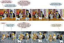
(From The Wotch. Click for full-sized awkward moments.)

Good evening. Today I’m here to talk about a grave condition afflicting webcomics all across the land. I call it Casey and Andy Eyes.

This condition, afflicting many a webcomic but especially those drawn by marginal artists or those overly inspired by anime, has as its major symptom extremely large eyes, often taking up more than half the face, with outlines that stop in the inside. Also accompanying it is rather cartoonish-looking faces, with features formed very simply. No cure is known aside from a general improvement in art skills, either on the part of the artist or, in more extreme cases, a replacement of the artist with someone more skilled.

Okay, so the only two webcomics I’ve actually seen the condition in are Casey and Andy itself and The Wotch. And El Goonish Shive. (You might be able to stretch it out enough to include Sluggy Freelance as well.) But isn’t it odd that they share almost the exact same art style? How can this sort of weird coincidence possibly happen? The Wotch FAQ implies that Anne and Robin might not have the genders they’re portrayed as; is it possible that Anne Onymous is secretly Andy Weir?

And what the hell am I doing criticizing art styles? Am I not the guy who has long held that art doesn’t matter?

Well, yes.

This is not a review of The Wotch in general. I might decide to write that review at some later date. But this is because I still haven’t found anyone backing my opinion and I’ve seen plenty of people hold up art as the holy grail. This is an attempt to codify what art in webcomics actually means, what counts as bad art and what counts as good art, and why the art of Order of the Stick and, in my opinion, Ctrl+Alt+Del fall under the latter.

Because I still don’t understand why CAD gets hammered for its art style. The lines are straight and polished, there’s actual shading on the characters, there’s variety in character’s noses, the hairstyles aren’t a few semi-random angular lines but often sport actual, separated tufts, not just random spikes, and the characters look reasonably like real people you might actually meet on the street somewhere. Casey and Andy can’t claim any of that. Yet CAD having bad art is a joke as old as the strip itself and no one talks about Casey and Andy‘s art. Nor can C&A claim, like OOTS or xkcd or Dinosaur Comics or Irregular Webcomic, that its art style isn’t off-putting enough to turn me off to what might otherwise be a pretty good comic strip.

But why? If art really does matter after all, what do those strips do right that Casey and Andy doesn’t? At first glance, it might look as though there isn’t really that much difference between the OOTS art style and the C&A art style. It’s not just, as it was once explained to me regarding CAD, that those comics have good stories that overcome their marginal art, because that would seem to just as easily explain Casey and Andy‘s popularity. I think it comes down to this:

OOTS, xkcd, and Dinosaur Comics all revel in their cartooniness.

They accept that their art styles will never be any appreciably different from how they started out, and so they create their own bar of realism. A comparison of OOTS to any (well, most) of the hordes of its worse-drawn ripoffs will help to show this. OOTS follows its own rules of proportion, maintaining a proper amount of space between facial features and within the face, and none of it comes off as artificial. Casey and Andy is at least as cartoony as OOTS, yet it attempts to go for a realistic rendering of its characters, and in the process falls into its own twisted version of the Uncanny Valley.

For all that people criticize it, CAD‘s much-maligned “B^U” is actually a rather ingenious way of getting around this problem. Something that often doesn’t get a lot of credit is that Tim Buckley gets quite a bit of mileage from variations on a single face. It can be used to portray wonder, anger, shock, panic, excitement, happiness, and of course, boredom. The result is that CAD succeeds in creating its own bar for realism and only needing to pass that bar on any given strip. That’s all anyone needs to ask of it. Compare CAD with Real Life, which truth be told, has its own version of B^U. In fact its art style is strikingly similar to CAD‘s (at least Buckley has real eyes with different levels of closed-ness and not just dots!), yet it has never attracted anywhere near the same level of vitriol for it. (Neither, for that matter, has PVP, but PVP characters do vary in the size of their eyes, if only a little.)

Part of this is because part of what people really hate about CAD is its use of copy-and-paste as a shortcut. Copy-and-paste can be a turn-off, but mostly when it’s really obvious. There are a couple of different things someone can do when they catch themselves copy-and-pasting. They can attempt to hide it, either by trying to introduce certain subtle or not so subtle variations or putting the focus on the content of the dialogue. Or they can go whole-hog and embrace it, often limiting themselves to one piece of art per character, in the vein of Dinosaur Comics. Both approaches have their pitfalls. The former often works best when combined with the latter, or when there are a lot of variations, or when the writing is really good (or at least controversial). (CAD falls into the “lots of variations” category.) The latter works best when you go so far as to use clip art for it, or when the art is good enough to overcome the fact there’s not much of it, or when you set the bar for detail at a point that fits the quality of the art itself. (Trying to get really detailed when all you can draw is stick figures probably isn’t a good idea.) Sadly, I’m not sure Sandsday does the best job of any of those options.

So yes, it’s very possible that it is important for a webcomic to have at least passable art, and not seem like the random scrawlings of a ten-year-old. But at least in webcomics, it’s clear that there are some exceptions to that rule, including what I like to call The Wick Scalar Exemption: if the quality and detail of the art scale with all other aspects of that quality appropriately, whether it be by reducing the quality of the features to size with the quality of the body (while still maintaining good proportions) or by mitigating the impact of engaging in cut-and-paste, even if the overall quality is completely primitive (as in xkcd), it doesn’t count as bad art for the purposes of maintaining an audience because it should achieve a level of internal consistency.

This level can seem rather hard to reach, and I suspect part of the problem people have with “B^U” is that it is ever so slightly jarring with the quality of the rest of Tim Buckley’s bodies, and gives just a little too little detail. (Similarly, I’d say Sandsday‘s biggest problem is that, for the most part, it has an Order of the Stick level of detail, but only two or three mouths per character, not to mention no hair and no skin color. On the other hand, perhaps the reason Real Life escapes the B^U charge is because it doesn’t provide as much detail in the eyes!) Certain features, such as straight lines and appealing curves, are pretty much sacrosanct, but in at least some areas of webcomic art, it’s more important to know how good you are than to try to be any better than that. Strips like Casey and Andy and The Wotch try to be better than they really are, stuff their comics with too much detail, and fall flat. The lesson of strips like Ctrl+Alt+Del is that, assuming you aren’t a photorealistic artist, it takes a Goldilocks to make an appealing webcomic – you have to get the balance just right, but the balance is more important that how much you stuff on each side.

And I promise that next week, it’ll be a real review of a real webcomic that won’t become a review of any of the Big Three out of nowhere.