Once upon a time, you went to the newsstand to pick up the newspaper, some highbrow and lowbrow magazines, and the favorite comic books. That was the first comic book distribution system. It was marked by a wide variety of genres and publishers until about the 1960s.
Then comic book stores and the direct market sprung up. That was the second system, and it was marked by the dominance of superheroes, DC and Marvel superheroes especially.
Now DC and Marvel are making considerable gobs of money outside comic books while Diamond’s anti-small-publisher practices portend a potential mass move to the Internet and comics are starting to bang on the door of bookstores.
I’m not sure what will replace it or if anything other than webcomics replaces it, or what the third system will look like, either in terms of the distribution mechanism, the selection of genres, or the diversity of publishers. But it’ll be very different from the second system.
(The model of the monthly comic is really rooted in the first system. If DC and Marvel decide to move to mostly a graphic novel format, or move entirely to the web, I think you’ll see those “pamphlets” become basically unheard of.)
Day 35 or 36 on the BottomLine Watch. It keeps on turning…
We all know that, among other ways Augusta National is intensely protective of its Masters broadcasts, it forces CBS and now ESPN to use a 1995-ish CBS graphics package for the Masters.
But either NBC has a change to its graphics in the works and its production of the Golf Channel’s coverage of the Players Championship includes graphics, or the Players is just as controlling about its graphics as Augusta.
(From Sandsday. Click for full-sized going around in circles.)
EDIT: I forgot to remove this post when I actually DID post the strip before leaving earlier today. I’m spending the weekend in the Portland area for a wedding. I may have street signs NEXT weekend. But not as many as I would have otherwise hoped, at least from this trip.
Day 32 or 33 of the BottomLine Watch, and still the BottomLine remains the “old” BottomLine. Perhaps ESPN’s technicians should experiment less with adding periods to the end of headlines and more with getting the new BottomLine back on the air – assuming they’re still changing it.
TNT has been rather interesting to watch during the playoffs for the experimentation they’ve done with the little line above the box assuring you that yes, this is a playoff game. First, although early in the season words like “OPENING WEEK” or “REMEMBERING MLK” would appear standalone above the box with no background other than the action, at the All-Star Break a long rounded rectangle appeared.
This rounded rectangle continued into the playoffs, alternating between “2009 PLAYOFFS” and some indication of where the series stood…
…but the indication of where the series stood quickly changed to look similar to the “2009 PLAYOFFS” logo, instead of plain white text on a dark grey background. Why? My guess: readability.
That’s not the end to the changes! Just in time for Celtics-Bulls Game 7 came another change, with “2009 PLAYOFFS” gone entirely…
…and for the Conference Semifinals, it’s now alternating between “2009 EAST/WEST SEMIFINALS” and the same indication of the status of the series as before.
Maybe this will actually remain constant through TNT’s coverage of the Eastern Conference Finals.
Finally, Versus introduced a new banner for its coverage of the NHL’s Conference Semifinals.
I have to say, it looks a lot more professional – the font isn’t right out of ESPN’s graphics early this decade, and the team logos aren’t standing alone and hovering over slightly turned-to-the-side circles in a way that just screams “cheapo operation”… too bad the banner was the ONLY thing that changed, and all the other graphics look exactly the same, creating jarring dissonance. If you’re going to change your graphics package, change it ALL AT ONCE. You couldn’t wait until next season? (Assuming they ARE going to change the rest of the graphics…) And what are those things on the side in HD? You couldn’t just have the stripes extend across the whole screen, you had to put doodads on the sides?
(I hold out hope this will mean Versus’ hockey, college football, and college basketball graphics will actually look like one another, and the IndyCar graphics will have at least a superficial resemblance, but who knows?)
(Can someone explain to me why every YouTube video of an IndyCar race I can find is either direct from IndyCar.com and lacks any graphics, or has what appears to be an international or online graphic directly based on the graphics ESPN used last year, not the Versus graphics? I found one video after the first race that would work IF it didn’t somehow manage to avoid showing the banner at all. It’s a shame, as Versus has tweaked the graphics somehow after just about every race, mostly in ways having to do with the display of positioning for “on-board” cameras, which was impossible to read for double-digit positions in Race 1.)
Well, the idea that every theme would reset to the beginning, and my idea for the last episode of IWC, appears to be dead.
Instead, we get the first appearance of “Me” in over four months, seemingly unaffected by the chaos enveloping IWC in the meantime.
If I may say so myself, I would suggest that David Morgan-Mar would need to do a lot of lawyering to claim he hasn’t violated his original “someone dies!!!” strip. “No ghosts”? “No witty banter with the Head Death before returning”? Well, technically the Me that got killed didn’t become a ghost, and technically this isn’t the same Me that had “witty banter with the Head Death”…
Honestly, I’m not sure what to expect from IWC for the rest of the year, or the rest of its existence.
I was directed to the specific image, not the page itself, and I find it fascinating that there are lights popping up only in what could be called “civilized” areas. Not just localized in cities; almost exclusively in the US, Europe, and to a lesser extent, India, East Asia, and for whatever reason, the southeast coast of South America.
Da Blog Poll on the future of the RID is being extended through the end of June. Someone is going to tell me what to do with the RID if it’s the last thing I do.
Someone tripped over my power cord and snapped it and now I need to wait for a new power cord to show up, so until Wednesday or so expect posting to be very light as I try to save as much battery power as I can.
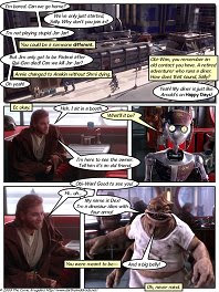
Honestly, I don’t understand Sally at all anymore.
A couple of weeks ago she was dismissing not only Jar-Jar but the entire game as incredibly “childish”.
Now not only is she back in the game, but – despite still dismissing Jar-Jar as “stupid” – she’s going back into the same well of incredibly ridiculous characters.
Is she growing up, or isn’t she? And is she just now a device to invent everything ridiculous you can find in Star Wars, whether or not it makes sense for her to have a character from which to do so?